Saturday, October 2, 2010

This Spring, I'm ready for...

Marc Jacob's seventies feel :

Diane Von Furstenberg's colors :

Lanvin's timeless elegance :

Color block

All we see in magazines is that this fall and winter's new IT trend is minimalism. I guess it's true, a lot of shows have had very very austere garnments but I think that we should precise it's not just any kind of minimalism. It's the 21st century's minimalism. Very simple yet totally refined. Curves, lines, forms, texture, volume, eveything's there just toned down by little accessories and an attitude. At YSL, black, blue and dark green were the dominant colors. What made the show were really the little spots of bold and vibrant colors here and there. The shoes for example! And the fur collar! But some other designers decided minimalism needed a shake : a big explosion of bright colored paint! At Versus for example : the dresses (which probably not everyone considers minimalistic, I have to agree!) were hot red, at Marni pants were aubergine and mustard yellow, at Dries Van Noten, the full-lenght skirts shined in vibrant purples boldly paired with kaki green oversized sweaters.
Maybe you can just say minimalism is one of the trends of this season and what I just talked about isn't; but in my opinion, everything coming up this fall is through a form of minimalism, wether austere or daring different. It's like a twist : black and white minimalism we know about, now it's time to move on to structured yet colorful clothes.
The article in WSJ's fashion edition demonstrates this : their spread "New Neutrals" showed very simplistic blue dresses from Calvin Klein with beige and brown shoes and bags worn by a black woman, the entire thing against a pop orange backgroung. All the colors matched perfectly because they were plain and vibrant. Just like the spread in ELLE France in which pink and red are mixed, green and beige match and red and black click! The perfect example of color blocking? Balenciaga's high heeled loafers. So many colors, literally one on top of the other!
Great way to keep up a smile while going through the rough upcoming winter!

Rick Owens this spring

I usually don't like Rick Owens, I find it too gothic, too unwearable, too uncontrolled but not in the sexy, wild way. I'm just not usually attracted to his clothes. But this morning I went on style.com and decided to check the spring collection anyway. And I was blown away! By the simplicity of everything, by the spacey elegance of the dresses, by the rigidity of the cuts, the unique lines and forms of the garnments. The colors were taken from a neutral palette, as usual : dominant black, gray, taupe and white. But it was great because definitely in our time : right when minimalism has made its way back into our wardrobes, Rick Owens is a must. The hair and makeup too were amazing because they really stuck to Rick Owen's usual style, without being repetitive though. I love the alienish hair accessories. Owen's fashion always has little touches of space and fiction, I think it's the maison's signature. And designers who can be recognized like THAT are good. Very good.


Uliana Tikhova


Karlie Kloss


Frida Gustavsson


Kasia Struss


Vlada Roslyakova


Melissa Tammerijn


Uliana Tikhova


Yulia Kharlaponova


all photos from style.com

Sunday, September 12, 2010

I want it all!

Yes I want it all, the fame, the fortune and all (oh gosh High School Musical, that was BAD!! Remind me never to do that again!), but most of all, I want the clothes! The clothes from Jean-Charles de Castelbajac F/W 2010-2011 Collection!
I was just doing what I usually do on the internet which is look up tons and tons of designers, photographers, models and musicians to "learn my stuff" and I got the idea to do on JCDC's site. I watched the video of the show there and oh wow, I want to see it again and again and AGAIN!


The shoes! Just look at the shoes! Who else than JCDC could pull that off? Huh? NO ONE! I love them, oh goshy joshy I love them!


This one reminds me of Snow White's evil Stepmom.

I don't think you really need me to see the obvious inspirations : medieval times, religious representations and old fairy tales. Personally, I'm in love :)
Thank you Jean-Charles!

(all pictures are property of JCDC's site)

Eastern (twisted) minimalism


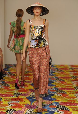
Philosophy di Alberta Ferretti RTW Spring 2011
After looking at pictures of Philosophy di Alberta Ferretti's RTW Spring 2011 show on WWD, I just HAD to run to my blog and publish something about it. It was just exquisite!
The cuts, the colors, the vibe... It was all brilliant! Contrarely to what we keep seeing on these season's runways (chic, bourgeois minimalism in neutral colors), the show was full of hot yellows, vibrant greens, bold blues and vivid oranges which were all brilliantly tamed down by clean cuts and shapes. Plus, something that seemed completely off this season was ever-so present : PRINTS. Prints e-v-e-r-y-w-h-e-r-e. Most of them tropical, exotic almost as if they came out of a brightened Gauguin painting, others a bit more discreet in black and white.
What I loved was that it was just so different from everything else we've seen this season, so UNEXPECTED almost as if Alberta Ferretti hadn't seen any of the shows or been aware of the new trends (which is impossible,let's face it). No, Alberta probably saw all this, I guess she just decided not to take notice of it.
The whole feel of the show reminded of Jean-Paul Gaultier's old shows, very wild and exotic. They were some sort of "souvenirs", marks of his travels. I guess the Eastern vibe is the cause for this.
Actuallt, come to think of it, it also reminded me of Versace a few seasons ago and of Dries Van Noten's everlasting love of prints.
If you really want to make a bond between this line and this season's biggest trends, I guess you could see a form of minimalism through the clean cuts, but then it would be a second degree minimalism which didn't include getting happy colors out of your closet. And that, is just a nice thought to wrap your head around you know? Being able to be chic without having to throw away everything that isn't black, white or beige out of your wardrobe.


(all images belong to Women's Wear Daily's site)

Wednesday, September 1, 2010

On our way to tolerance

Two days ago I bought Crystal Renn's Hungry at WH Smith on Rue de Rivoli. I've always been interested in model's journey from normal life to, well, model life I guess! I had prepared myself for some sort of diary but really, it has nothing to do with that! First of all, the book was full of statistics, results from searches, of numbers, studies... It was more than a book, it was a very well put together mix of facts and feelings. I learned a lot about, not only the closed minded modeling world (I'm not putting the whole industry in the same boat, and I'm only talking about the physical part, not creative part) but also the definition of fat/overweight/obese that's not at all what it should be. I'm not going to repeat everything I read so I'll stop there, but really it's a very interesting book. I think why I like it is because it's a mix of personal point of view (how Crystal Renn became severely anorexic for example) and proven facts (like the fact that not AT ALL 65% of Americans are fat).


HUNGRY by Crystal Renn and Marjorie Ingall, $25.00, 27,50 euros available at WH Smith.

Moving Armani

I was particularly touched by Giorgio Armani's interview in British Vogue's September issue. Vassie Chamberlain, the brilliant woman who wrote the piece, was really able to capture a feel that, I think, added to the meaning of the interview. Armani's words seemed touching and deep, not babbled but thought of; he gave the idea of a rested, nostalgic, fashion loving man. He's also very charismatic. He's the kind of man that I admire, the kind I want to meet, he makes me think of the image I have of the first haute couture designers.